公共顶部
首先我们对顶部区域进行一下规划,我们简单地将其分为3块区域:
- 博客标题区域
- 标语区域(包含主标语与副标语)
- 菜单区域
然后根据区域划分我们把HTML DOM结构建立好:
<div class="top-container">
<div class="title-menus-area">
<div class="blog-title">
<?php echo get_theme_mod('blog_title') ?>
</div>
<div class="top-menus">
This is menu area
</div>
</div>
<div class="tagline">
<div class="tagline-main">
<?php echo get_theme_mod('main_tagline', 'Free the Internet') ?>
</div>
<div class="tagline-split"></div>
<div class="tagline-sub">
<?php echo get_theme_mod('sub_tagline', 'Across the Great Wall we can reach every corner in the world') ?>
</div>
</div>
</div>
OK,接下来是CSS样式,还记得吗?我们要全局应用flex布局,再加上vw视口单位,现在我们来试试看 :
header {
width: 100vw;
height: 14.5833vw;
background: #222222;
display: flex;
justify-content: center;
}
.top-container {
width: 62.5vw;
height: 100%;
}
.title-menus-area {
display: flex;
width: 100%;
height: 5.0833vw;
justify-content: space-between;
}
.blog-title {
display: flex;
font-size: 1.4583vw;
font-weight: bold;
color: white;
margin-top: 1.125vw;
}
.tagline {
display: flex;
width: 100%;
flex-direction: column;
align-items: center;
}
.tagline-main {
color: white;
font-size: 2.5625vw;
margin-bottom: 1.4583vw;
line-height: 2.5625vw;
}
.tagline-split {
background: #F6F8FA;
width: 4.1667vw;
height: 0.2083vw;
margin-bottom: 1.7708vw;
}
.tagline-sub {
display: flex;
color: #8A8A8A;
font-size: 0.8333vw;
line-height: 1.4583vw;
}
看起来就像是这样:


很酷,不是吗?这时候细心的人会问,后台关于menus的配置在后台里找不到呀,这是因为没有在functions.php里注册menus配置:
function my_menus() {
$locations = array(
'primary' => __( 'Desktop Horizontal Menu'),
'expanded' => __( 'Desktop Expanded Menu'),
'mobile' => __( 'Mobile Menu'),
'footer' => __( 'Footer Menu'),
'social' => __( 'Social Menu'),
);
register_nav_menus( $locations );
}
add_action( 'init', 'my_menus' );
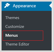

我们的菜单设置回来了,现在我们来把菜单填上:
<div class="top-menus">
<?php
wp_nav_menu(
array(
'container' => 'nav',
'theme_location' => 'primary',
)
);
?>
</div>
这样菜单就全显示出来了:
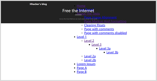

我们先从后台删掉一些菜单,然后把样式加上:
/* 顶部菜单 */
.top-menus {
display: flex;
padding-right: 1.5417vw;
padding-top: 1.3854vw;
height: 0.8333vw;
}
.top-menus li {
display: flex;
list-style: none;
margin-right: 2.0938vw;
}
.top-menus li:first-child{
margin-right: 3.151vw;
}
.top-menus li:last-child{
margin-right: 0;
}
.top-menus a{
color: white;
font-size: 0.8333vw;
line-height: 0.8333vw;
text-decoration: none;
}
.top-menus .menu {
display: flex;
margin: 0;
padding: 0;
white-space: nowrap;
list-style: none;
}
/* 先把二级菜单屏蔽起来 */
.top-menus .sub-menu{
background-color: transparent;
position: absolute;
margin-top:2vw;
visibility: hidden;
opacity: 0;
display: flex;
flex-direction: column;
}
最后就是这样的效果了:


看起来不错,对吗?不过我们目前没有处理菜单的展开和移动端下的菜单样式,这些我们之后会一一完善。
总结和预告
今天,我们完成了首页通用顶部区域,通过CSS我们可以对DOM结构做到绝对的控制和美化,我们还为之后的顶部菜单展开和移动端菜单样式预留了空间。
明天,我们将继续往下制作页面的文章列表区域,还记得吗?我们之前的设定是双栏结构,除了主内容区域以外,还有一个右侧边栏(后期我们可以随意在右侧边栏和左侧边栏之间进行切换),明天我们将把这些结构统统建好。
如果你喜欢这个系列的文章,赶快关注我们(数字江湖异志录)吧,不要错过后续的更多干货噢。